Designed for the present.
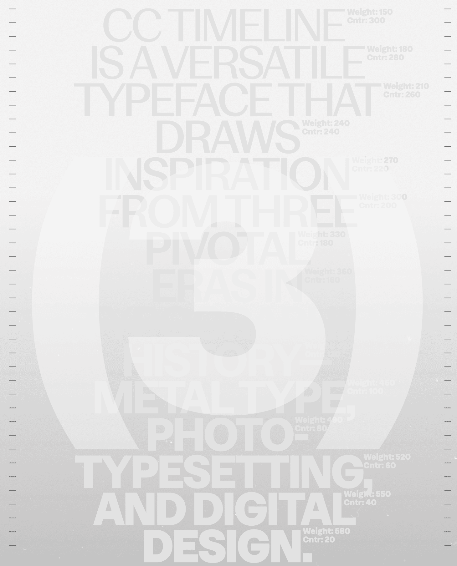
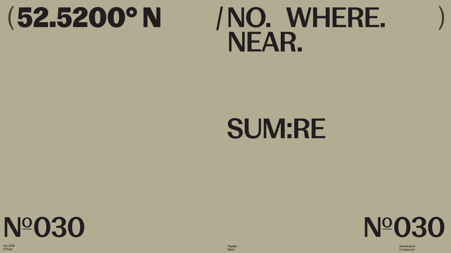
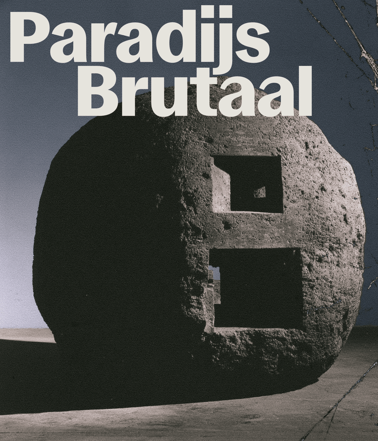
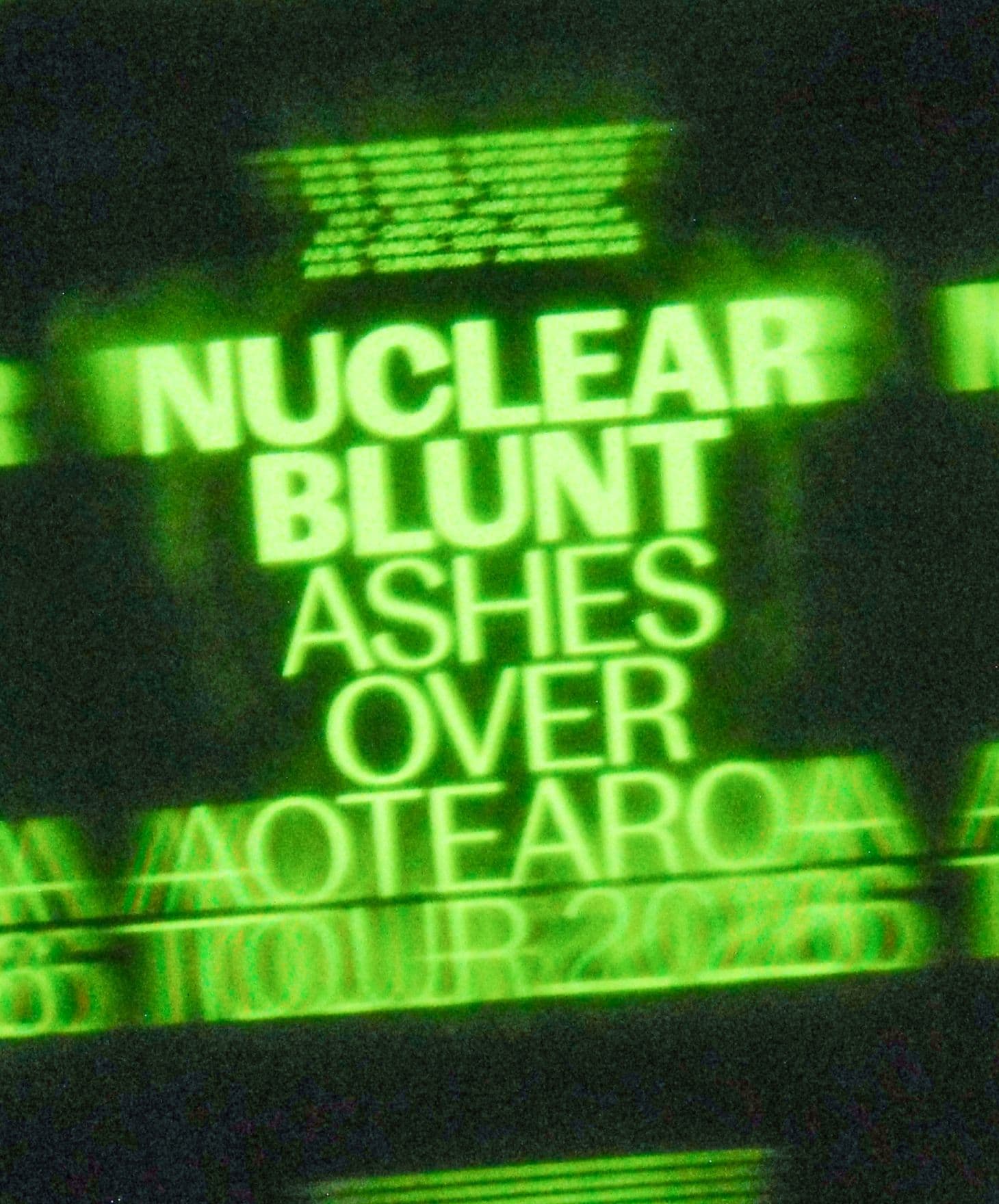
CcTimeline is a versatile typeface that draws inspiration from three pivotal eras in typographic history: metal type, phototypesetting, and digital design. By synthesising characteristics from a wide array of sources, CcTimeline feels both new and familiar in equal measure. The result is a font rooted in tradition yet designed for contemporary use, seamlessly adaptable across a huge range of applications.
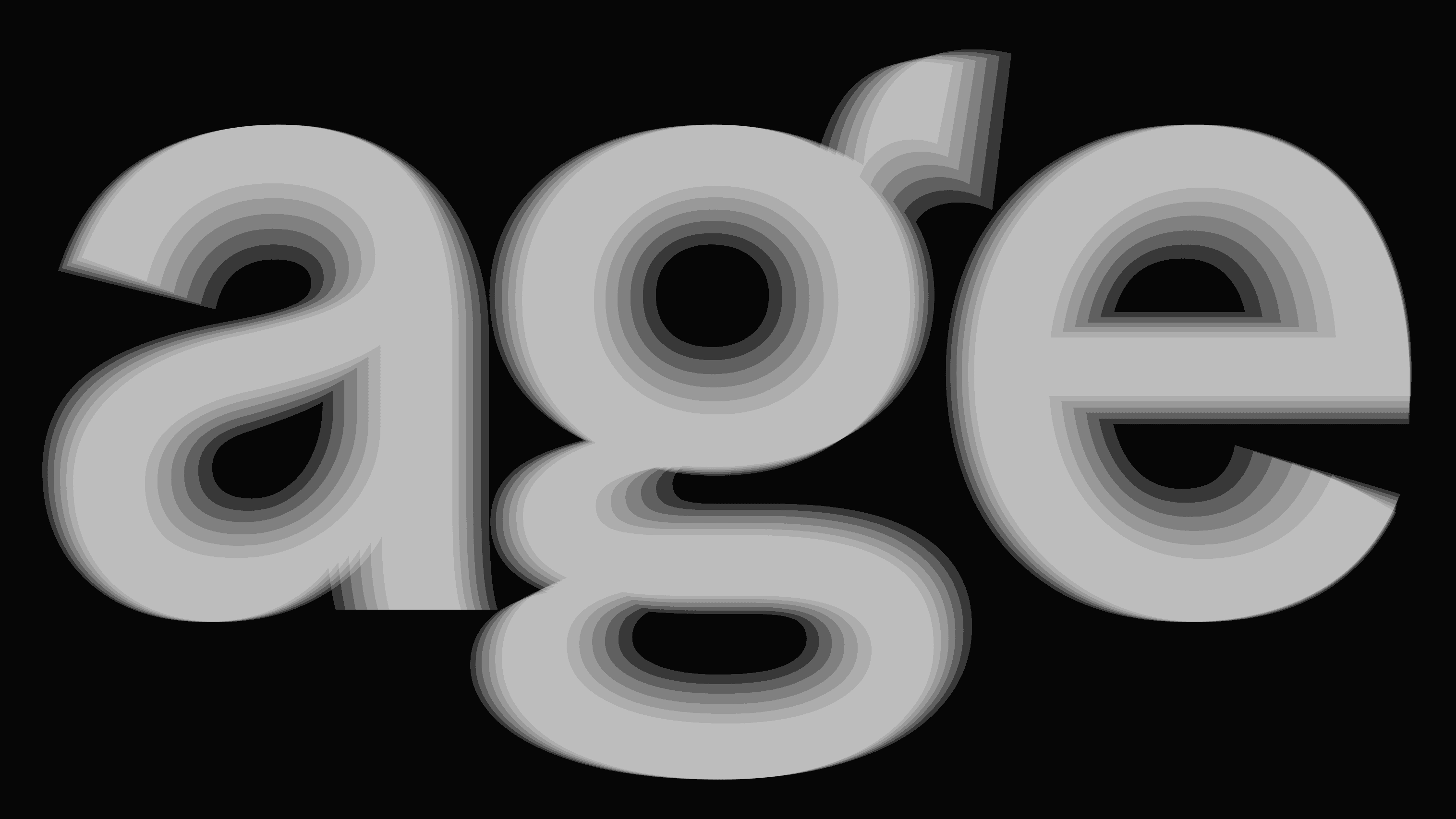
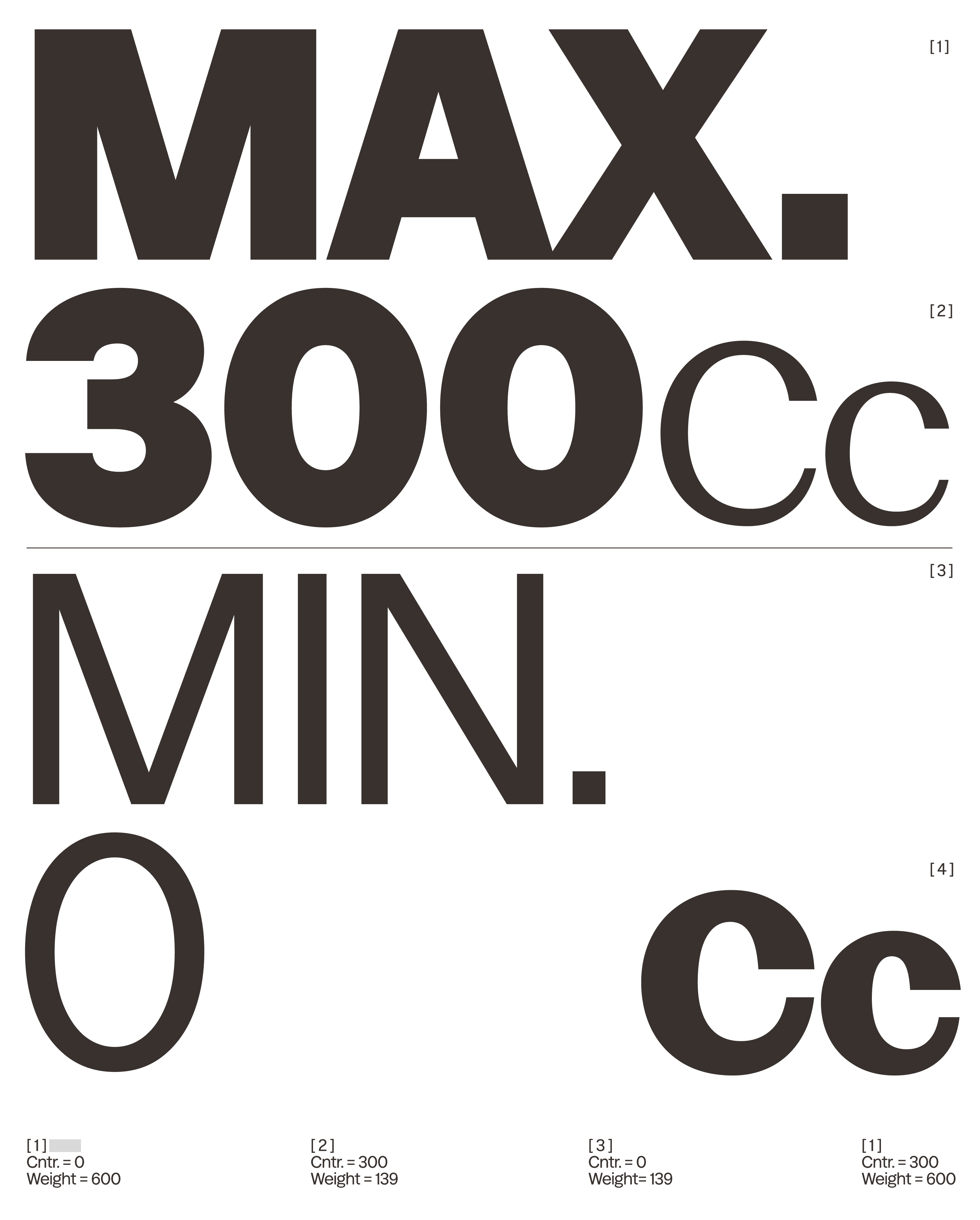
Available as a multi-axis variable font with weight and contrast axes, it also offers extensive OpenType features, providing designers with rich options for customisation and expression.

3subfamilies
18styles
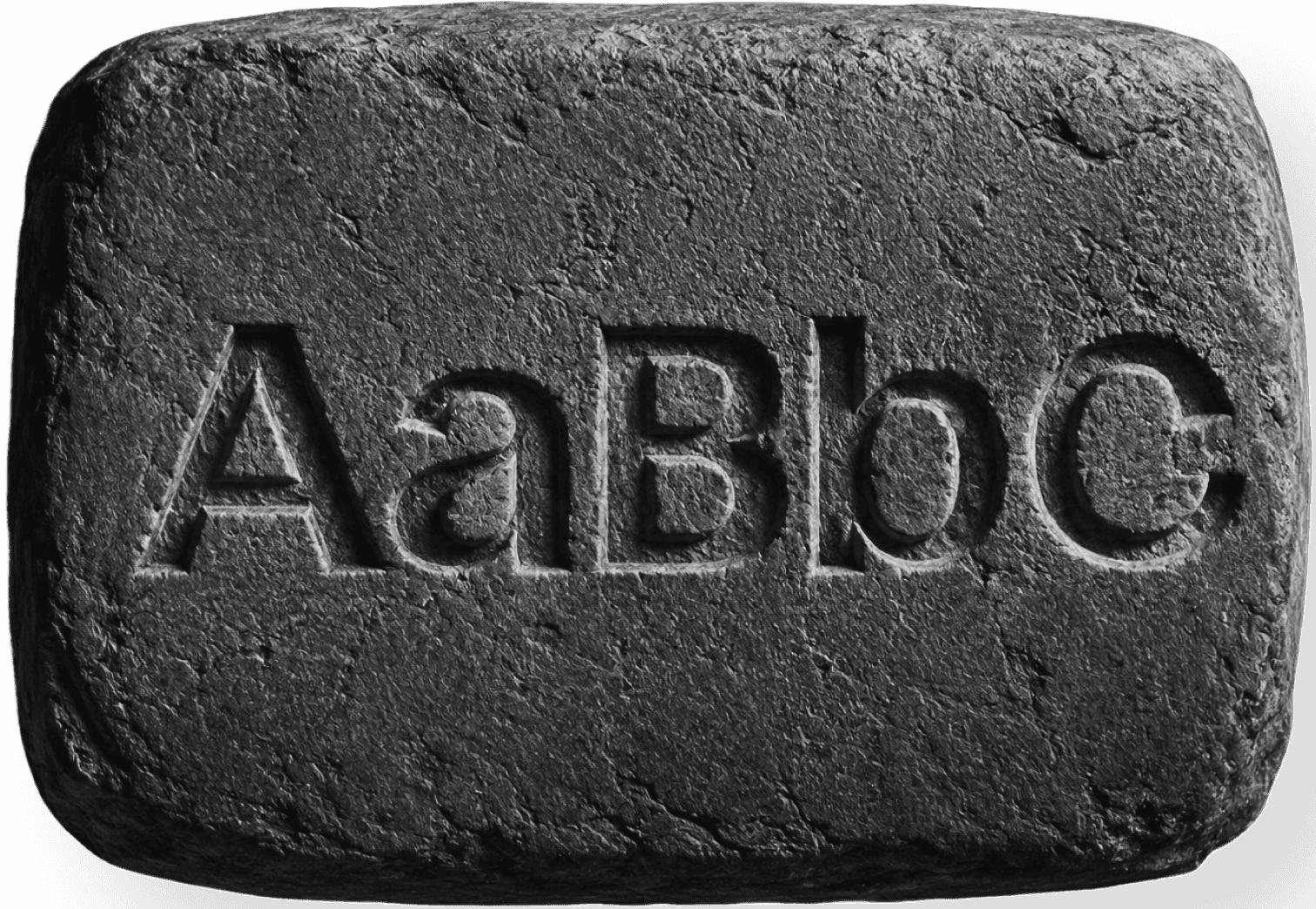


Timeline is the first typeface from CC Type–a type foundry by Koto.
It synthesises characteristics from a wide array of sources to create something that feels new and familiar in equal measure. Available as a multi-axis variable font, it also offers an extensive OpenType features, providing designers with rich options for customisation and expression.
Johannes Gutenberg revolutionised printing by inventing a mold that produced reusable movable metal type. This made printing faster and more efficient, while later advances in the 1800s made creating type designs much easier. Phototypesetting later replaced movable type by using photographic technology to create characters. It improved working conditions and allowed designers to produce a much wider variety of typefaces, shaping printing for about 50 years. In 1966, Rudolf Hell introduced the Digiset, the first fully digital typesetting machine. It created characters digitally using pixels and led to the development of early digital fonts like Digi Grotesk, although separate versions were still needed for different font sizes.
Timeline, inspired by key eras in typographic history, is the first typeface from CC Type –a type foundry by Koto.
It synthesises characteristics from a wide array of sources to create something that feels new and familiar in equal measure. Available as a multi-axis variable font, it also offers an extensive OpenType features, providing designers with rich options for customisation and expression.
Phototypesetting, which replaced movable type printing, used photographic engineering principles to produce a variety of characters from a single letterpress, and its convenience brought significant improvements to the work environment. In addition, the technology made it possible to easily develop many beautiful typefaces, bringing greater variety and new creative possibilities to the printed page. Although the era of phototypesetting lasted only 50 years, it dramatically changed the history of printing before eventually disappearing with the rise of digital typesetting.
It was only the arrival of the Digiset—a typesetting machine invented in 1966 by German engineer Rudolf Hell—that finally removed the need for any physical material when creating characters. The Digiset was the first fully digital typesetting system: put simply, characters were reproduced using a cathode ray tube (similar to those used in televisions) that directed light to specific points, which today we would call pixels. This innovation marked a decisive break from photographic and mechanical methods, introducing a completely electronic approach to typesetting and laying the foundation for modern digital typography. Hell also created the first digital font, Digi Grotesk. Introduced in 1968, this sans-serif typeface was available in seven different weights and, like all early digital fonts, was made in bitmap format, meaning the exact positions of the pixels used to produce each character were stored in the file. The new digital fonts could be modified much more easily than earlier typefaces, and the new typesetting technologies made them faster and more efficient to use in professional printing. However, they had one important disadvantage: a different set of characters had to be created for every font size, making the design and storage of complete type families both time-consuming and memory-intensive.
Timeline, inspired by key eras in typographic history, is the first typeface from CC Type –a type foundry by Koto.
A little of the past. Designed for the present. By Koto.
It synthesises characteristics from a wide array of sources to create something that feels new and familiar in equal measure. Available as a multi-axis variable font, it also offers an extensive OpenType features, providing designers with rich options for customisation and expression.
Gutenberg’s key invention that sparked the printing revolution, as I described from a couple angles in the first two parts of this series, was a type mold that allowed the creation of individual, reusable, “movable” pieces of metal type. The difficulty in creating original designs in hardened steel, which ultimately produced metal type for printing, was removed as a gating factor in the late 1800s.
Phototypesetting, which replaced movable type printing, used photographic engineering principles to produce a variety of characters from a single letterpress, and its convenience brought significant improvements to the work environment. In addition, the technology made it possible to easily develop many beautiful typefaces, bringing greater variety and new creative possibilities to the printed page. Although the era of phototypesetting lasted only 50 years, it dramatically changed the history of printing before eventually disappearing with the rise of digital typesetting.
It was only the arrival of the Digiset—a typesetting machine invented in 1966 by German engineer Rudolf Hell—that finally removed the need for any physical material when creating characters. The Digiset was the first fully digital typesetting system: put simply, characters were reproduced using a cathode ray tube (similar to those used in televisions) that directed light to specific points, which today we would call pixels. This innovation marked a decisive break from photographic and mechanical methods, introducing a completely electronic approach to typesetting and laying the foundation for modern digital typography. Hell also created the first digital font, Digi Grotesk. Introduced in 1968, this sans-serif typeface was available in seven different weights and, like all early digital fonts, was made in bitmap format, meaning the exact positions of the pixels used to produce each character were stored in the file. The new digital fonts could be modified much more easily than earlier typefaces, and the new typesetting technologies made them faster and more efficient to use in professional printing. However, they had one important disadvantage: a different set of characters had to be created for every font size, making the design and storage of complete type families both time-consuming and memory-intensive.